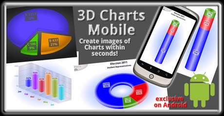
All Charts and can be rendered in 3D and 2D. The App supports landscape and portrait. Save the 3D Charts as image featuring multiple options include high quality transparent png (for graphic designers) or as jpg file with customizable compression (for web publishing). The data input will be stored automatically and can be copied to Android's clipboard as text for pasting. All charts are highly customizable, set your own colors number scaling precision caption width height font size ...
Figure 1: Initial Screen
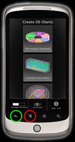
All Charts are grouped in 3 different types. Choose a group.
Group 1: (Single Series Percentage Charts):
- Pie
- Doughnut
- Pyramid (+ upside-down, just turn your device)
- Cone (+ upside-down)
- Funnel (+ upside-down)
- staggered Column
- staggered Cylinder
- Line
- Area
- Column
- Cylinder
- Surface (colored by series or height)
- Stepline
- floating Area
- floating Column (Renko as single series)
- floating Cylinder
- Bubble
- Line
- Area
- Rose
- Toggle the app's background theme (black & white).
- Force Stop (Exit) the Application (saves some battery, will prevent the app from multi tasking).
- Info pop-up with support mail and links, User Manual.
- Toggle fullscreen mode, show/hide notification bar (nice for multi tasking, consumes image size).
- The back key always takes you to the previous screen and closes any pop-ups select boxes and color picker without setting new values.
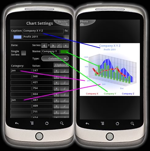
The Chart Settings User Interface is quite intuitive and self explanatory and kept simple while satisfying even professionals. Here the multi series input of the Combination Charts is shown to the left and the resulting rendered output chart to the right. Use the add row, insert series or arrow to the next series and delete X button to navigate the datasets. Note, some of the Category Text Input Fields are left blank here to avoid overlappings and to render a clearly visible chart which is easy to read. The Category Text can include a special character string \r\n like 'January\r\n2011' to insert a carriage return new line:
| January 2011 |
You can find the '\' key on Android's onSreen keyboard by clicking > ?123 > ALT
An option to display the category text vertically can be found too for languages written top down. Of course you can use the voice recognition for text input. The Value Text fields are restricted to numbers dot for decimal float integers and minus (except percentage Charts) characters. No digit pad input so far. Values text input fields can be left blank too as discontinuous or missing data. Some text fields are set to replace mode. UTF-8 is supported. So type Chinese Korean Arabic Hebrew if you like. ÇÖéØ
Here a few images in (small portrait, extreme 3D to 2D, original size reduced by 50%) rendered with the same datasets of the above figure 2 but with different rotation and 3D 2D Camera settings each.

The last image shows an anomaly. Not enough room for proper big size 3D rendering. To avoid this do set the width and height to more quadratic values and go down with the 3D-2D slider value. The first image is extreme 3D positioning. That consumes height even in portrait. In landscape you can render very big charts! You definitely should play around with testing Landscape and Portrait mode.
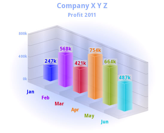
Checking the Single Series box will reveal color buttons for the category. The Alpha transparency of the selected Series Color button does apply for all category colors though. If displaying datasets consisting of a few values only than showing the values (with cap, set cap alpha to 0 for values without cap) might be a nice option to consider. See below (Landscape, original size 100%):
Further options:
The width / height sliders are in percent of the stage / screen size. Just remember your mobile device features high resolution DPI dots per inch screen compared to a desktop monitor. This means Chart images will look way bigger on PCs. Tablets and Smartphones with high screen resolutions (ppi points per inch) are supported and can render even bigger graphing images.
Tick that check box called 'fx' next to the caption to add a button type effect to the same as well as to the legend if rendered. Set number prefix like '$ £ ¥' or suffix like 't' or 'k' for tonnes and kilo even '%'. For the Combination Chart's canvas one can set a maximum value below the highest value of the elements as highlight effect. These max and min values are calculated automatically if left blank. The minimum can be above zero. The slicing option of the pie percentage charts can be turned off to save space. Tap on the topmost piece of a staggered chart to toggle slice all. Scaling font size and even percentage number precision can be set. For scaling note that you should prepare the value precision (this is about the only deference to Advance-Media's web based interactive animated and real time database charting software tool). 1000 can be turned by scaling to 1k and 1500 to 1.5k yet 1547 will be rendered as 1.547k so use zeros. M stands for Million! Official SI abbreviations. Value 3D-2D aspect ratio slider for Cone Charts: Known issue here is that a Cone Chart is rendered properly up to about 25 aspect ratio only. For all staggered types note that the first data row will appear at the bottom ... one starts to build a house with the bricks of the base foundation. The bevel slider rather sets the bevel brightness. Pie and donut radar/polar will look better in landscape and a staggered column is preferable in portrait. The text layout changes to the left right or around any percentage charts in landscape mode. A pyramid cone and funnel chart can be rendered upside-down by turning your device upside-down while the text will remain right-side-up. The 3D line of the Combination Chart is hollow at the bottom. This means it will look better if rendered either in 2D or having an increased camera angle. The line's 3D thickness is a true miter calculation which need some space. So don't try to render 300 data points with a screen width of 400 pixels, use a different chart type! Combining different Chart types for multi series charting definitely increases the visual distinction of each series in 2D as well as in 3D (see multi series images above). So there is no need any more for a difficult to read 2D clustered or staggered charting approach to depict multi series. For all canvas charts one can set a maximum value below the value of the elements as highlight effect. These max and min values are calculated automatically if left blank. The minimum can be above zero.
Add extra limit average or trend lines to the Combination Chart's canvas. Required here is a 'Start' value only. All further fields are optional. The name of such an additional line if left blank will show the start value on the scale, if the name is is filled with a single blank SPACE like ' ' than no value at all will show yet this name could be any string like 'Average ' (extra spaces appended can avoid overlapping) or 'Limit 5-6'. The 'End' value can be used to draw a slant line. It represents the height of this line on the right side of the chart's canvas. You may think about the 'Zone' value as thickness of the drawn line. This thickness value depends on the scale of the y axis. For example if you render a chart with a range between 0 and 10 and the zone value is 2 and its start value is 5 than this zone will fill an area on the canvas from 4 up to 6.
Surface charting explained with demo (download ZIP containing XML for import):
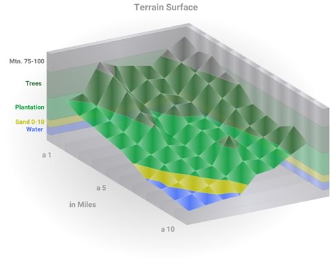
Any surface graph is native in 3D and inherently requires a minimum of two consecutive series to render. Two different types of surface charts do exist. Surface colored by series and surface colored by height or so called region (fractal calculation). The afore mentioned additional limit or average lines serve as switch to toggle between these surface types. Surface colored by the series will show if no extra line is added. When adding lines while rendering a surface chart the system will switch to colored output by height or region. In this case the 'End' and 'Zone' values of these additional lines can be neglected. Do start with the first region at the bottom of the chart. If the Chart is scaled from 0 to 10 and the first line is having a start value of 2 than this will output a region from the bottom 0 up to 2 and if adding more regions like next 'Start' value set to 4 and 6 8 and 10 ... than one gets a surface having colored regions from 0-2, 2 up to 4, ... 8-10. Also he alpha transparency of each series is used even for the colored by region surface type yet the alpha transparency of the very first (0-2 of this example) region determines the alpha value of all the regions lines on the canvas. Set this value to 0 to completely hide these additional lines or zones on the canvas. If the 'Divisional Lines' field (below) is left blank no such values will show even for the colored by height surface chart and you can add your own scale values by adding an alternative scale manually to the 'Name' of the region (line) like 'mid. 2-4'...'4-6' etc.
Please download and extract (file manager app required) this ZIP to your Android file directory firstly (keep the folder structure: \Charts_Mobile\combi\Surface_Demo.xml) then use the import function which can be found at the very bottom of the 3D Charts settings:
demoXMLsurface.zip
Here is your preview of the XML imported and rendered as image in landscape:
Floating Area floating Column floating Cylinder and Bubble require 2 values per element, high and low or maximum and minimum (bubble charts with this setup perhaps look best in 2D, rotation supported up to 89 in theory, more than 7 or 8 bubbles are rare because bubbles consume space on the x-axis). The range value cap of floating Charts will be visible only if the respective cap field is populated. The canvas can be hidden by setting Alpha to '0' and the values of the divisional lines can be hidden by supplying a blank instead of a number in the respective input field.
Personalize and customize your charts by adding your own background and foreground images (this could be your corporate company logo). Select any photo from Android's gallery or from a list of files or set your own path. Supported formats are jpg (non-progressive) png (alpha transparency supported) or the first frame of a gif or swf flash file. (xy image position is always left upper corner)
Figure Color Picker:
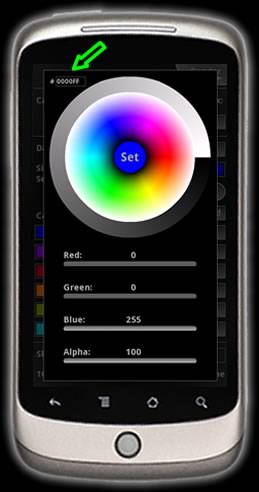
The Color Picker pops up after tapping on a color field in the Chart's Settings. The center of the color doughnut shows the selected color and alpha transparence (if available, see slider bar). Tap on the center to set this color. The green arrow in the figure points to the hexadecimal color text field. There one can copy and even paste (select, long press) values too. Tip: Choose brighter colors for a dark background and darker colors for bright background.
Save As Options (Image Export):
You will find the Save As Options in the Chart Settings close to the bottom of the screen.
Choose between jpg and high quality transparent png or jpg file with customized compression there first. The 'Photo' button of the render preview screen will toggle to 'Saved' or 'Error' after clicking. Go to Android's native Gallery App and pick up (share attach) the saved image from there afterwards.
The jpg file with customized compression may take 1~2 seconds to calculate.
FYI: This app is available exclusively on Android due to the excellent Adobe Air support.
Wishing fun with mobile 3D charting, be convincing, be successful!
Watch 3D Charts Mobile video:
Find the app in the Android Market - Google Play:
3D Charts Mobile FREE (Only the Combination Charts are watermarked on output)

3D Charts Mobile PRO (FULL)

Contact support feedback suggestions bugs feature requests mail:
info @ advance-media.com
Full/Mobile Homepage:
www.advance-media.com
The software comes in an as is condition.
No liability!
All rights reserved.
Page views: 30830
